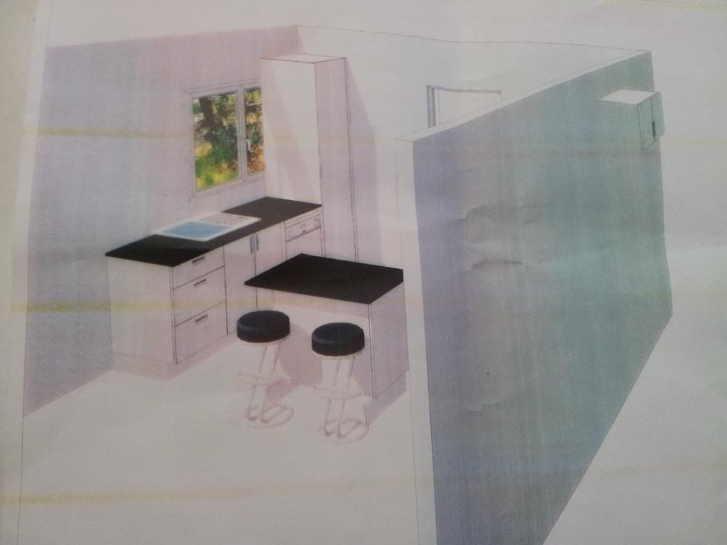
So I've shown you the 1st kitchen design plans and now have the 2nd kitchen design in my hot little hands to show you.
Here is the window side with the sink, dishwasher and pantry in the corner
The window will need to be bricked in a bit where the pantry sits which I'm not convinced about (see my suggested changes in 4th image below)
This is the view from the fridge side which will house the oven, stove and microwave
I love that there will be a decent amount of bench space next to the oven for cooking
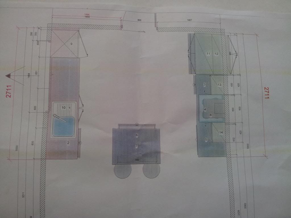
This is the areal view of the plans showing the Island Bench in the centre so you can walk around the kitchen on either side.
The door takes you out into the Laundry/Powder Room and is the only access to the backyard. It is also the shoppers entry into the Garage we built on.
I like the fridge/oven design side and I like the Island Bench (yes I've been convinced because of the bench space I'll gain next to the oven!) but I don't like that the pantry will be smaller than what we have now and we'll need to spend time and money replacing the window. So I've come up with a new design for that corner ....
Instead of putting the pantry in the corner, I want to put it against the back wall with overhead cabinets on top. It will be as narrow as the bench top but longer so still the same amount of storage. Then in the corner, we'll put open shelving to display my kitchenware and cookbooks can go on the bench top underneath.
With the pantry removed it will give us a longer bench to fit in a bin drawer or something similar and no need to move the window which will be a saving of about $1000.
I was totally off the Island Bench and dead set on the L Shape Bench but thanks to your advice and comments I've come round to the Island Bench. What would I do without my helpful readers thanks to all of you I really appreciate it :)
As for the storage space issue that was settled getting out the tape measure and comparing both plans, although Design 1 looked like it had more cupboards, there was dead space in those corners and it would look very busy and probably make the space look smaller. Design 2 has a better flow and openness to it plus it actually had more usable bench space especially near the oven and about the same amount of storage space other than the extra appliance cupboard that sadly I won't now get. Design 2 has more drawers vs mainly cupboards in Design 1 - my vote is for drawers all the way baby so I can actually access everything in there!
The quote for Design 2 is $14,000 which is $3,000 more than Design 1 but includes mainly all drawers (vs cupboards), assembly, installation and granite bench tops (vs mainly cupboards, not installed and laminate bench tops). Plus we have dealt with the company before they did our bathroom vanity which has a stunning granite bench top so we know they do great workmanship.
It is such a relief to have chosen the company and design basis, we just need to tweak the pantry position and then we'll be able to finalise the design this week!
Pin It Now!


Love what you're doing, loved your planning. I wouldn't be without our drawers, the only cupboards we have are under the sink. xxx Rae
ReplyDelete